Are you repelling users with your product design?
Your seemingly innocuous product design could be repelling or alienating underrepresented users. Make it better by adopting a more inclusive and welcoming design. Here's why it's important, and how to get there.
Good product design attracts, bad product design repels. Yet not everyone experiences bad design in the same way. Too often, marginalized and underrepresented users experience unintended product outcomes like anguish, anxiety, and a feeling of alienation. This can happen when a product's entire userbase isn't fully considered in its design. How do you avoid repelling and alienating users and build a product that's inclusive and welcoming, one with a truly universal appeal?
I'm regularly reminded of the importance of inclusive design, particularly in children's products. Both of my children are Black, and our family is often disappointed when characters in and on clothes, toys, and books don't match our children's skin colour and hair texture. As an example, the only way I was able to get a Black Lego minifigure was to buy a Women of NASA kit which included Mae Jemison. Lego doesn't think it's a problem.
Here's one example of short-sighted design in an electronic product for children. I'll tell you what wrong, why it might have happened, how it could have been avoided, and walk through how the design could be improved. Frankly, I was disappointed when I learned how the team responsible for the design's shortcomings addressed them.
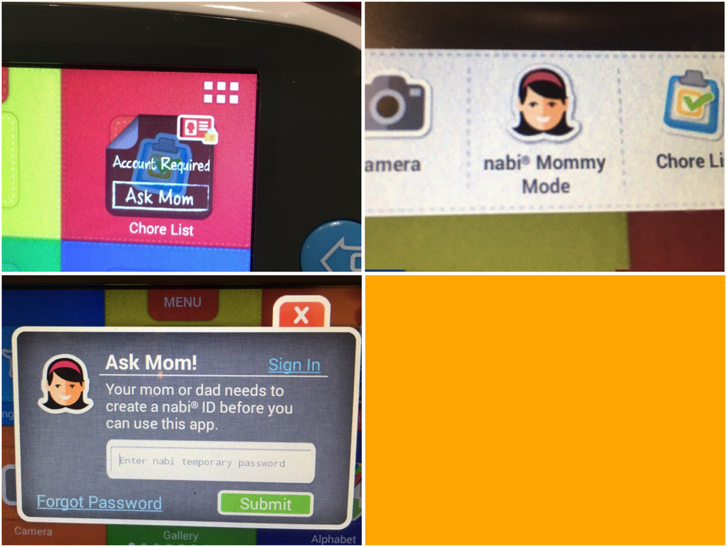
Both my children have Nabi Jr. tablets, full-featured Android devices loaded with educational and fun apps for kids aged 3-5. They're locked down, but parents and caregivers can enter "Mommy Mode" with a password for software settings, app store access, and other utilities.
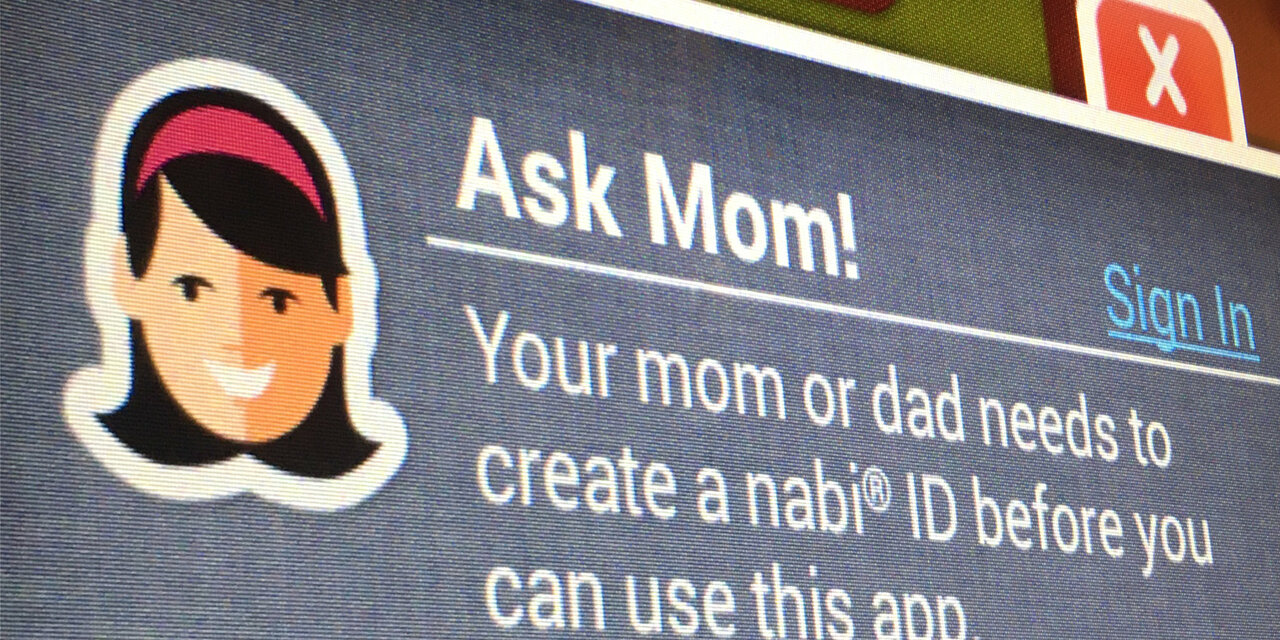
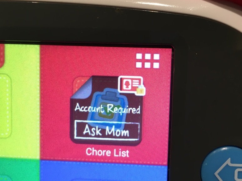
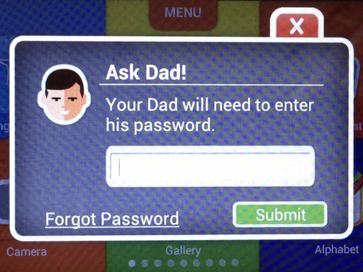
You read that right: Mommy Mode. Icons for apps requiring internet access are greyed out and overlaid with "Account Required. Ask Mom." If that wasn't enough, the top-right corners of these icons have what looks like a red ID card with a bob-haired silhouette and a tiny gold lock badge. Tapping the icon brings up a modal dialog titled "Ask Mom!". The silhouette is revealed to be a smiling white-presenting woman with a pink hairband. That same "mom" also appears in a menu which slides out from the top of the screen. At least the messaging is consistent.
To be fair, it does say "your mom or dad" in the text of the dialog, but even this messaging is inappropriate for many use cases. Consider how it might affect a grandmother or a step-parent as primary caregiver. How would a child in foster care or an orphan feel when reading it? These aren't "edge cases", they're people. Over 2 million children in the States live without either of their parents.
That microcopy and design also does disservice to many millions of other children and parents. Would a child of gay parents — or the gay parents themselves — see themselves in this Mommy Mode? What about people of colour and their children? My wife is Black. This digital mom doesn't represent her. The design doesn't fit, as it wouldn't for millions of other parents and children in North America. This is a huge oversight.
Why weren't these many parents and children considered in the design? To say the Nabi product team didn't care is probably far from the truth. It's more likely they weren't tuned to gender and racial bias. Bias affects us all and can lead to irrational decisions. Many people are biased towards mothers as caregivers and wouldn't give a second thought to this design. It wouldn't be surprising, then, if the team in charge of design and microcopy held this and other biases.
Similarly, a biased view of Nabi's users as white likely stopped its product team from considering alternatives to the fair-skinned bob-haired mother. Had the team been made up of active fathers, ex-foster or adopted children, people who grew up in mixed-family homes, as well as people of colour, someone would have noticed the limits of the Mommy Mode design and seized the opportunity for inclusivity.
Another possibility is that the team didn't fully consider their userbase. There are the children who play with the Nabi, sure, and there's also a parent or caregiver who supports it. Broadening that support userbase beyond mothers — and fathers — opens us up to many different considerations. Let's briefly consider a few user personas and pair a supporting user with each child. They're contrived, light on detail, based on assumptions, and would later be validated through interviews:
- Ofei - 5 years old, two parents; Mother Esi and Father Kofi as supporting users
- Lee - 3 years old, single Dad with a nanny; Father Tim and nanny Laura as supporting users
- Han - 4 years old, lives with grandparents; Grandfather Chen as supporting user
With these personas, a stereotype of a mother as primary caregiver — and a white one at that — just won't do. We need something else, something which conveys "give this to a grownup" to a child who probably can't even read. Too much detail could alienate the child and her supporting users. What we need is an abstract representation of stereotypical grownup-child interaction.
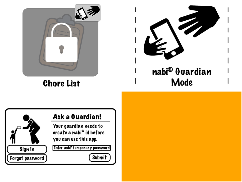
One such abstraction could be of a child handing a tablet to a grownup. We could use pictograms, as in the image below. More details could be added, like eyes and facial expressions, and the figures could be styled to fit existing aesthetics. Finer detail — clothes, hair, skin colour, etc. — could take away from the inclusive design we're trying to achieve. Cartoon animals and other non-human characters could also be used here, but tread carefully. Our biases and stereotypes are readily applied to cartoons if not kept in check.

That takes care of the dialog. What about the icon overlay and menu that bring us there? Those two locations have less space for our pictogram, so we need something even more abstract. In this case, we can zoom in on the hands reaching out to each other and add a bit of detail. Again, this image could be given a splash of colour and stylized to match the Nabi's overall design.

With the relevant design elements out of the way, we can turn to the microcopy. Good microcopy enhances design, but shouldn't exist to make up for a bad one. Our target users are 3-5 year-olds who likely can't read well, if at all, so any text is meant for an adult. Starting with the icon overlay, there are several things we can do to make it easier for a child to understand its meaning.
To a child who can't read, the existing icon overlay offers few hints as to its meaning. Children understand locks, but the one in the top right corner is too small to appear important. We should draw attention to it by making the lock larger. We'll also use our hands and tablet design element in place of the Mommy Mode badge in the upper-right corner, as well as in the top menu. In the dialog we'll replace the "mom" with our child and adult pictogram figures.
With these design changes, we can likely get away with less microcopy in the icon overlay. For the top menu and dialog copy, a rename of "Mommy Mode" is required. "Grownup Mode", "Big Person Mode", "Adult Mode" … any of these would fit, although that last one might raise a few eyebrows. When I consulted my 7-year-old, she suggested "Guardian Mode" as it could also apply to older siblings and adolescent babysitters. I thought that was a great idea, so we'll use it. We'll stick with the same instructions, though. Here, then, are alternatives to the existing microcopy and design:
Naturally, we'd test whether children and adults can make sense of these mockups. Still, we can already see how a small change in microcopy and design can lead to a more inclusive and usable product.
You're probably curious how the Nabi team solved the Mommy Mode challenge, making its design more representative of its users. Easy: a toggle under Mommy Mode switches it to Daddy Mode. Would you say this is an appropriate solution?
It's interesting to note that, had the Nabi team started with a more inclusive design, they wouldn't have needed to develop and support the two Mommy and Daddy modes. Developers had to add this option to the Nabi settings, and make the labels and graphics change depending on the mode. Software development is expensive, and these costs didn't need to be made.
How can you avoid the same oversight the Nabi team had with their product? If you want to ensure that your products are inclusive and welcoming, these three objectives will help:
- Consider your users, language, and tone during the ideation stage of your product, with personas and team members representative of your customers. Aim for diversity of experience, background, and perspective as well. Maintain this focus on underrepresented users throughout the product development cycle.
- Keep in mind any biases you and your team may need to overcome while designing and developing your product. Diversity in your team and your personas will help overcome bias, but more should be done.
- Workshop your design with people from other departments in your company, and test how well your users will understand and act on it.
These goals aren't easy, but they are worthwhile. Start slow and build momentum within your team. Approach building inclusive and welcoming products as a challenge and an opportunity to learn more about your users. You'll find new ways to provide value to your customers, and make your product easier to use — for everyone. The result will be something welcoming to all instead of repelling to some.
If you want to learn more about how appropriate design and microcopy can lead to a better experience, be sure to read To Design Better Products, Write Better UX Copy by Nina K. Feinberg of the New York Times. For a more in-depth read with a detailed guide to creating inclusive products, try the book Building for Everyone by Annie Jean-Baptiste, Google's Head of Product Inclusion.